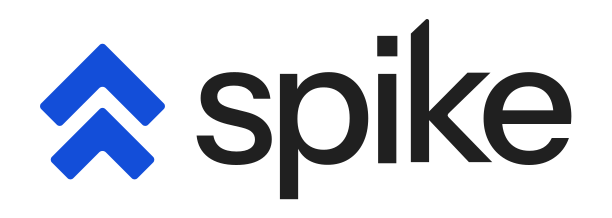



Today, we are introducing Spike’s new logo, a new website, and honestly, a new identity from the ground up. This is very exciting day for all of us at Spike.
More companies are being built today than at any other point in history. Small teams are making big products. And no matter the size of the team, every single one of them needs reliability. Reliability should not be a second-class citizen for any company, no matter where they are in their journey. That is what Spike is here for, and as Spike grows, we need an identity that speaks to all of them, from a solo founder who just wants to know the moment something breaks, to a large engineering team managing complex systems.
To get to this moment, this year we focused heavily on the product — making it easier to use, simpler, more intuitive. We rebuilt the app from the ground up and cleaned up components across the board. Once the product felt right, we started looking at everything else. And what we saw was that our identity had no consistency. The website was blue, maybe too blue one could argue but the social media header was black. The changelog images ranged from white, gray, gradients, and blue backgrounds. Every marketing material looked different because Spike had never found a home. With the product now in a much better place, a 360° refinement felt not just right but necessary. And with Spike growing rapidly, this was the right time to get it done.
During our team offsite in Goa last year, we decided to prioritise the rebrand. We needed someone who could help us figure out what Spike’s identity really was. That is when we found Nivedha from Project Inside Out, someone who is genuinely obsessed with identity as a craft.
Products have to be built design-first today. We are obsessed with giving customers a great experience, and that is what we brought to Spike. We are happy we built something that sets them up for the future.
– Nivedha, Project Inside Out
I met her at a cafe in Indiranagar, Bengaluru and we talked for nearly four hours. We talked about Spike, who our customers are, how the market is shifting, and somewhere in all of that, Spike’s identity started to take shape.
Introducing the new identity
The new logo is a double arrow. It represents the spike behind an incident, the moment something goes wrong and the signal shoots up. But every incident also needs to be resolved, and the spike has to come down. That is why both lines go up and down forming a arrow head. And then there is the second arrow, representing escalation. When something fires and nobody responds, Spike escalates automatically. All of that is captured in one mark.

It has allowed us to get more creative with assets. This is our new loader –
The new app icons –

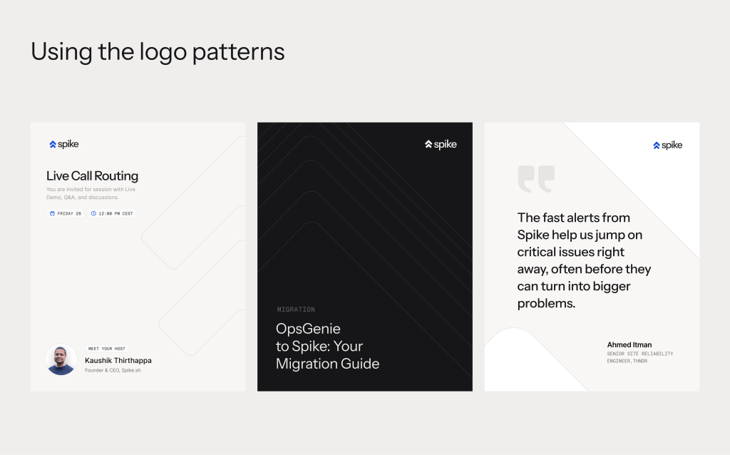
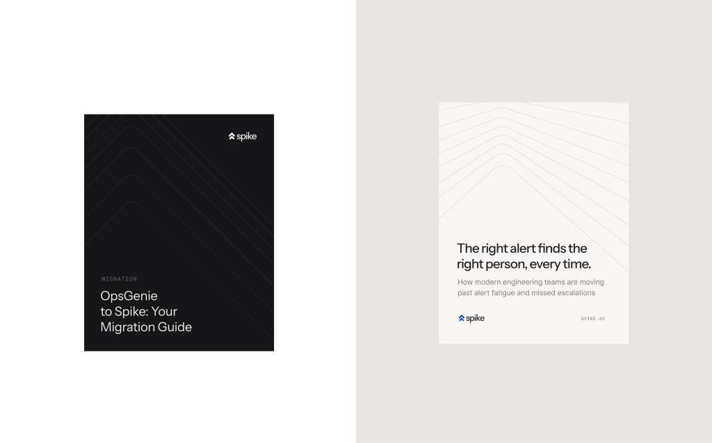

We still have our iconic blue, and it is front and center in the new logo. But you will notice more black across the website and our social media. It feels more deliberate and more confident, and it reflects where Spike is headed.
This identity is also built to scale. It represents the transparency and honesty that have always been at the heart of how we operate, and it is simple, clean, and welcoming. We have a lot planned for Spike, and we needed an identity that could carry the weight of everything we have planned for the future.
Thanks so much..
The opportunity to rebrand in the middle of a company’s journey is rare. Most companies do not get here, and the ones that do often do not take it seriously enough. The only reason we could do this, and do it the way we wanted to, is because of every customer who has trusted Spike and kept trusting it.
We are a bootstrapped company with no external funding. The only metric that has ever mattered to us is customers, and how well we are doing our job for them. Every customer who has stayed, who has given us feedback, who has told us what worked and what didn’t, they are the reason we crossed this point. We are all very grateful!
This is a new era for Spike. The identity is new, the product is rebuilt, and the AI chapter is just beginning. Over the coming years, helping companies stay reliable is exactly what we are here to do. That has always been our mission, and this new identity is a reflection of that commitment. We are going to share a lot more about how we build Spike going forward. You can follow along in our Building Spike series.
Let’s make reliability a first-class citizen. Thank you for being a Spike user.
Kaushik Thirthappa,
Founder, Spike.