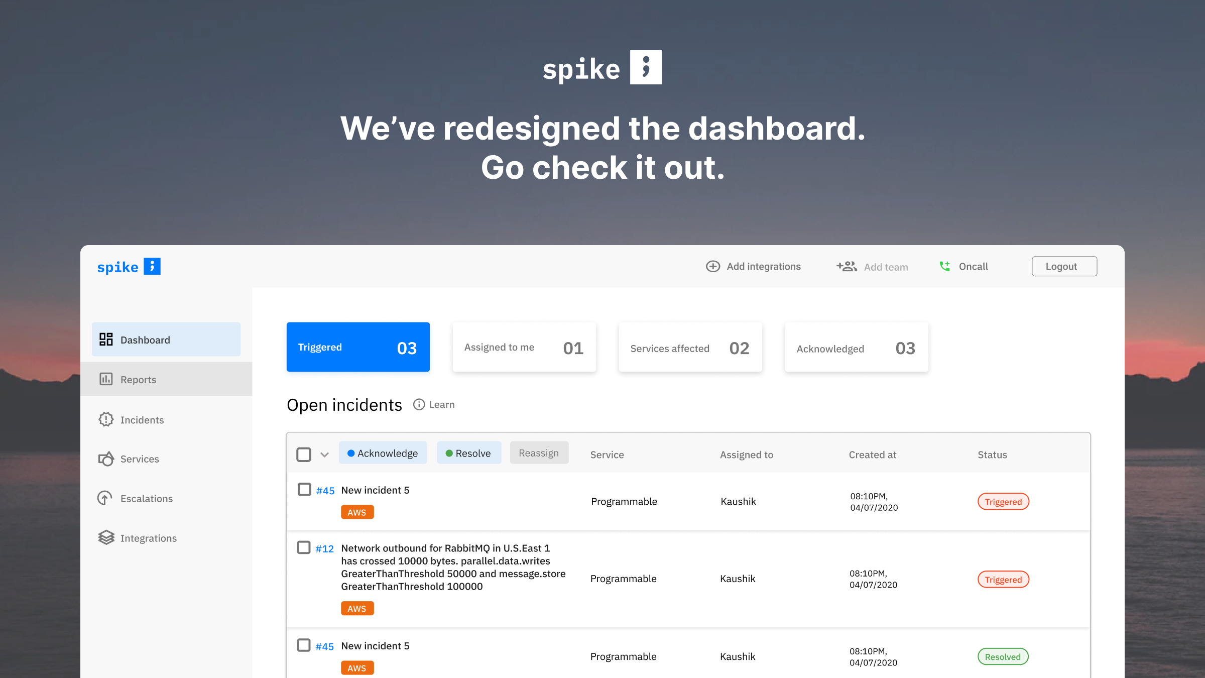
A dashboard is a visual representation of information in a simplified manner. Usually the dashboard provides an overview to the user and gives them access to the important information.
On Spike, the main purpose for the users to come on the dashboard would be to acknowledge and/or resolve an incident, and to check how many incidents for the entire team are open at the moment.
For the reason above, we wanted to create an effective dashboard that would enable the users to comprehend information easily and act on it immediately with ease.
Sidebar and icons
Before: A very blue sidebar comes gathers a lot of attention. That’s the same with the stats panel on the top. There is also confusion with order of colors in there. Like, is orange really the best color for services affected?
All these splashes of color takes attention from the incidents for which the user has logged in.
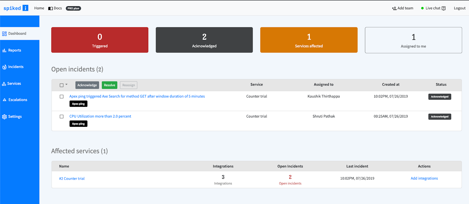
After: The desaturated color of the sidebar is easy on the eyes and also adds more visual emphasis on the dashboard table. Now the user can directly focus on the incidents and it’s statuses. The stats panel on top is to be tested more with regards to whether or not we will continue to keep it. Little usage and more space.. room for optimisation in the future.
- The width of the sidebar was increased to give it more room.
- Also, we moved the settings, contact, docs, and change log at the bottom of the sidebar, creating a separate section.
- Better looking and consistent icons were incorporated into the sidebar to nicely correspond to the terms. All of our previous icons came from material design. In this iteration, we are using some icons from The Noun project too.
This may also enable us to collapse the sidebar later in the future with just the icons visible. So, having the right icons were super important.
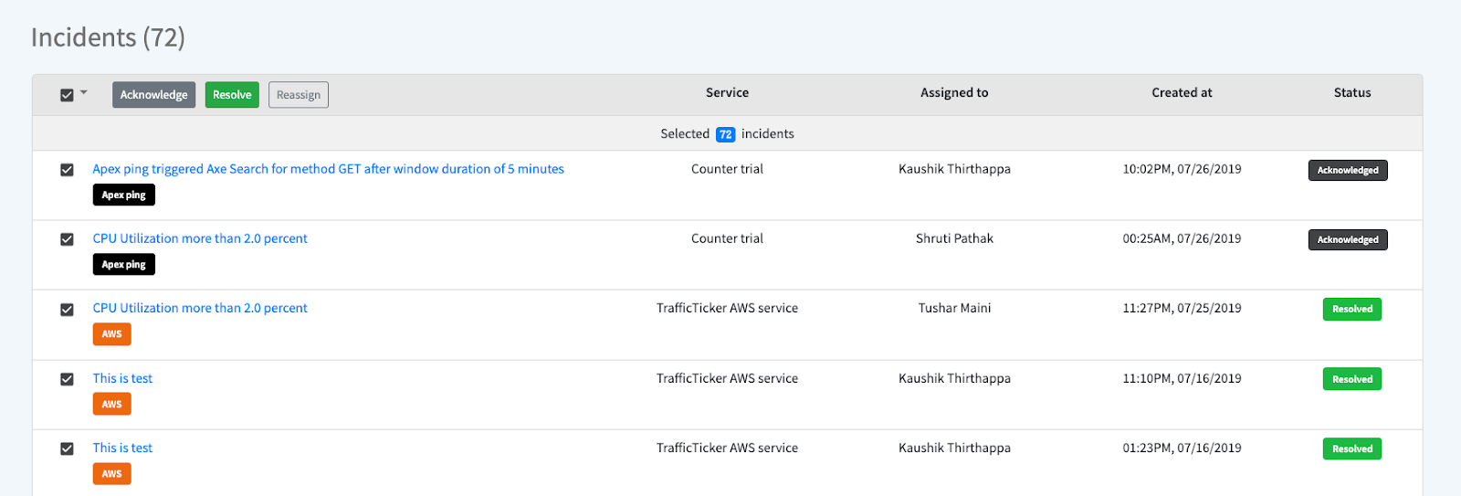
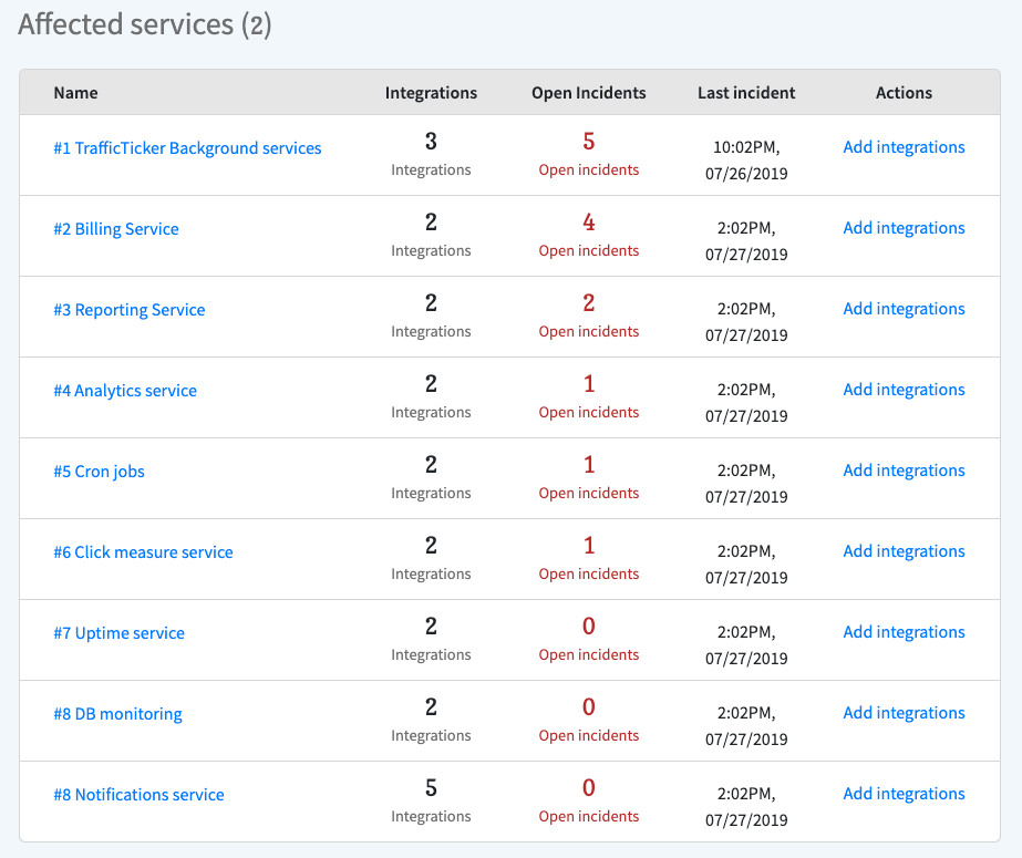
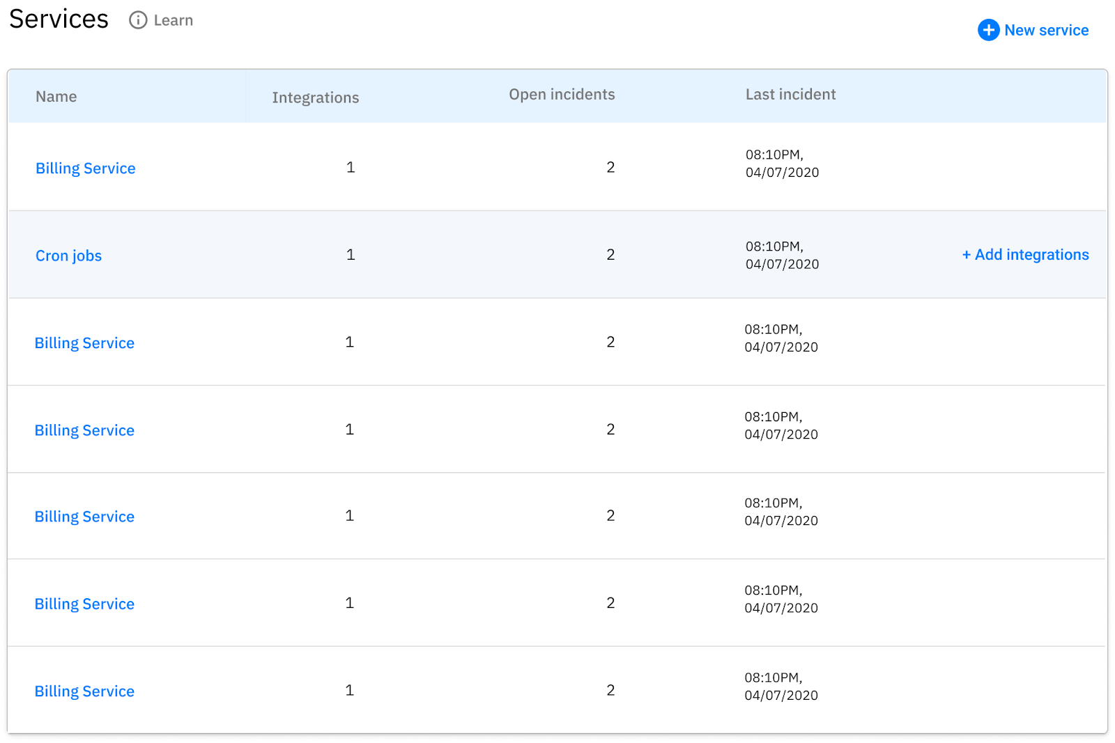
Tables and it’s elements
Our dashboard is full of tables. Some tables more important than the others. In our previous designs, almost all tables looked similar. This created a cloud of uncertainty as to what table are you looking at.
For the tables to be effective, the design had to be clear, consistent and simple.
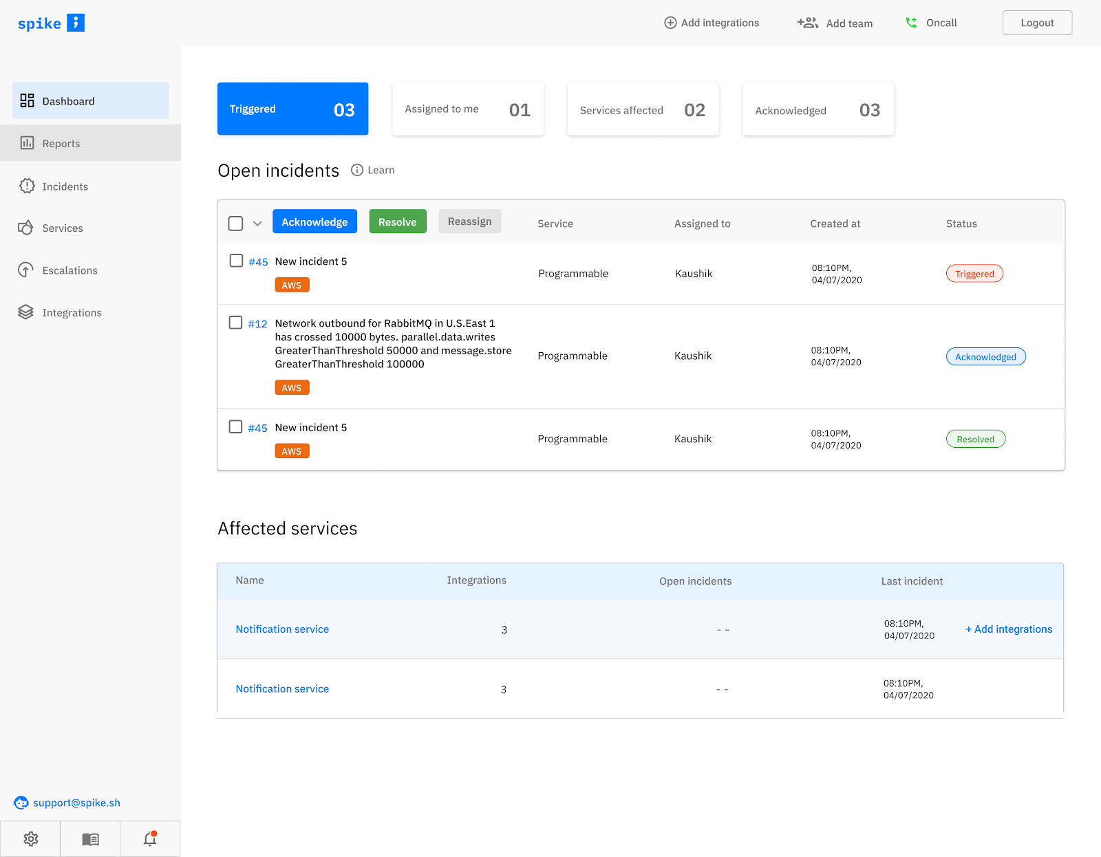
Before: Most of our tables gave equal emphasis to all parts. We also had all text center aligned and buttons and tags you will have a hard time differentiating.
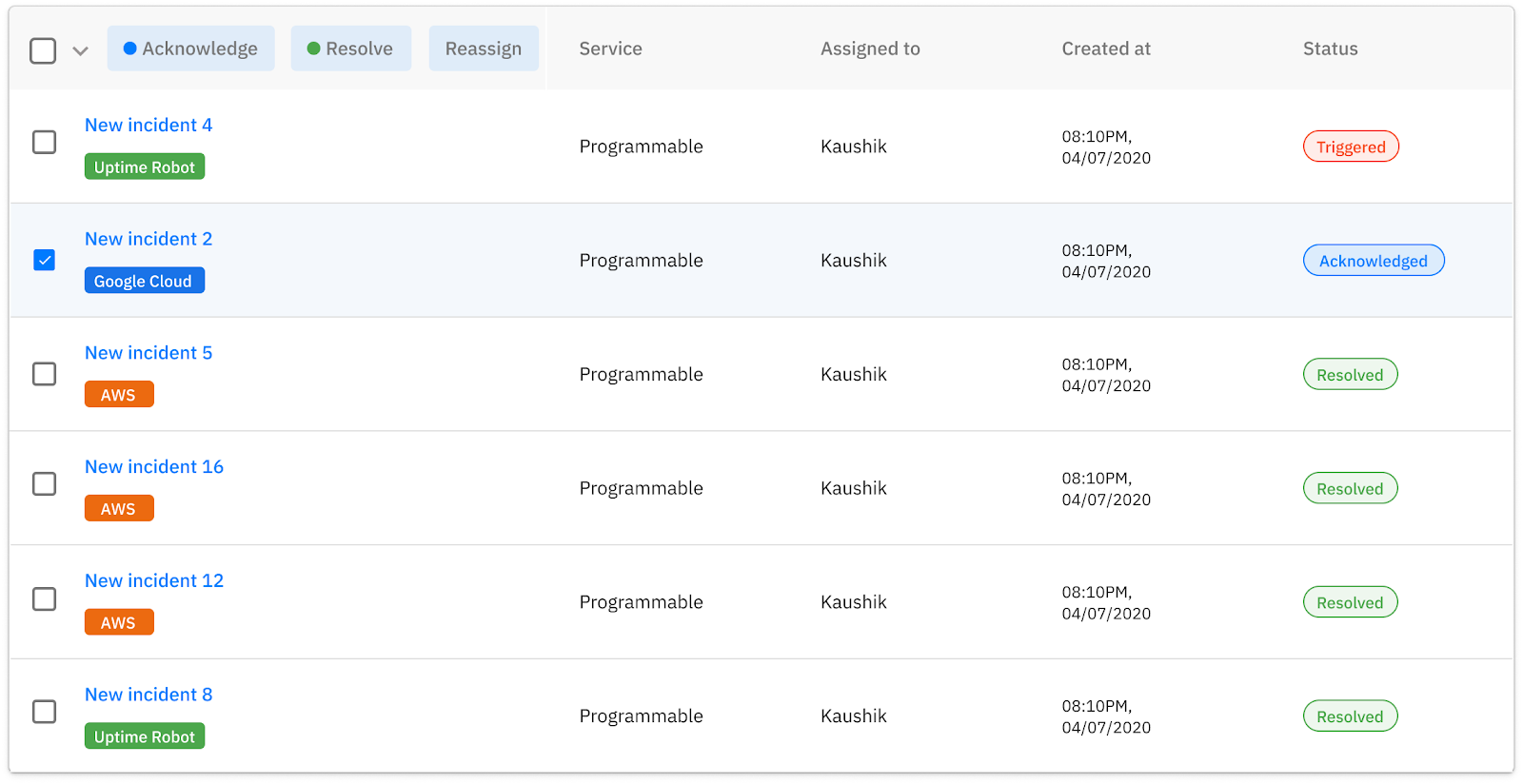
After: Tables for incidents have a different look since they are the most important ones. The escalations, services tables were redone to remove bloated information that wasn’t really needed.
- Text and number alignment – According to Google Material Design aligning all texts on left and numbers on the right is the best practice in dashboard design, which also had a huge impact on making the dashboard table look a lot neater.
- A visual hierarchy was formed by tweaking the contrast in typography.
- Colored Acknowledge, Reslve, and Reassign buttons inside the table header draw instant attention so that the user can easily identify them and act immediately.
- Colored Status tags (which has seen over 5 iterations in production) were incorporated for easy identification of the incident’s status.
- Repetition of colors to create a uniform theme – The action buttons were given the same color corresponding to the incident status, creating consistency.
- Hover actions – The option to edit an escalation and adding integrations appear only on hover, thereby avoiding clutter.
Some more screenshot below –
Let me know what you think of the new design. We have also done a crazy (in retrospective) amount of rework on the marketing website too.
Reach out at [email protected] or [email protected] with your feedback.